Knopka Dengi
“Knopka Dengi” – UI Design for a Personal Finance Super App
- Client: Knopka Dengi
- Type: Design Project
- Service: UX/UI Design
- Date: October 2022
- Industry: Microloans and Fintech
The task was to develop a complete UX/UI design for the mobile fintech application “Knopka Dengi” with an intuitive interface focused on fast financial actions such as transfers, expense analytics, and card and settings management. The project required a modern and visually appealing look, support for both light and dark modes, and full adaptation to mobile user interaction scenarios.
1. Business Goal Analysis
— The main goal is clear — to increase the conversion rate of microloan issuance.
— The target audience is defined: users looking for fast and transparent loan conditions.
— Pain points identified: lack of trust, complex terms, overloaded competitor interfaces.
2. UX Structure Development
— The landing page architecture and user flows have been thoroughly developed.
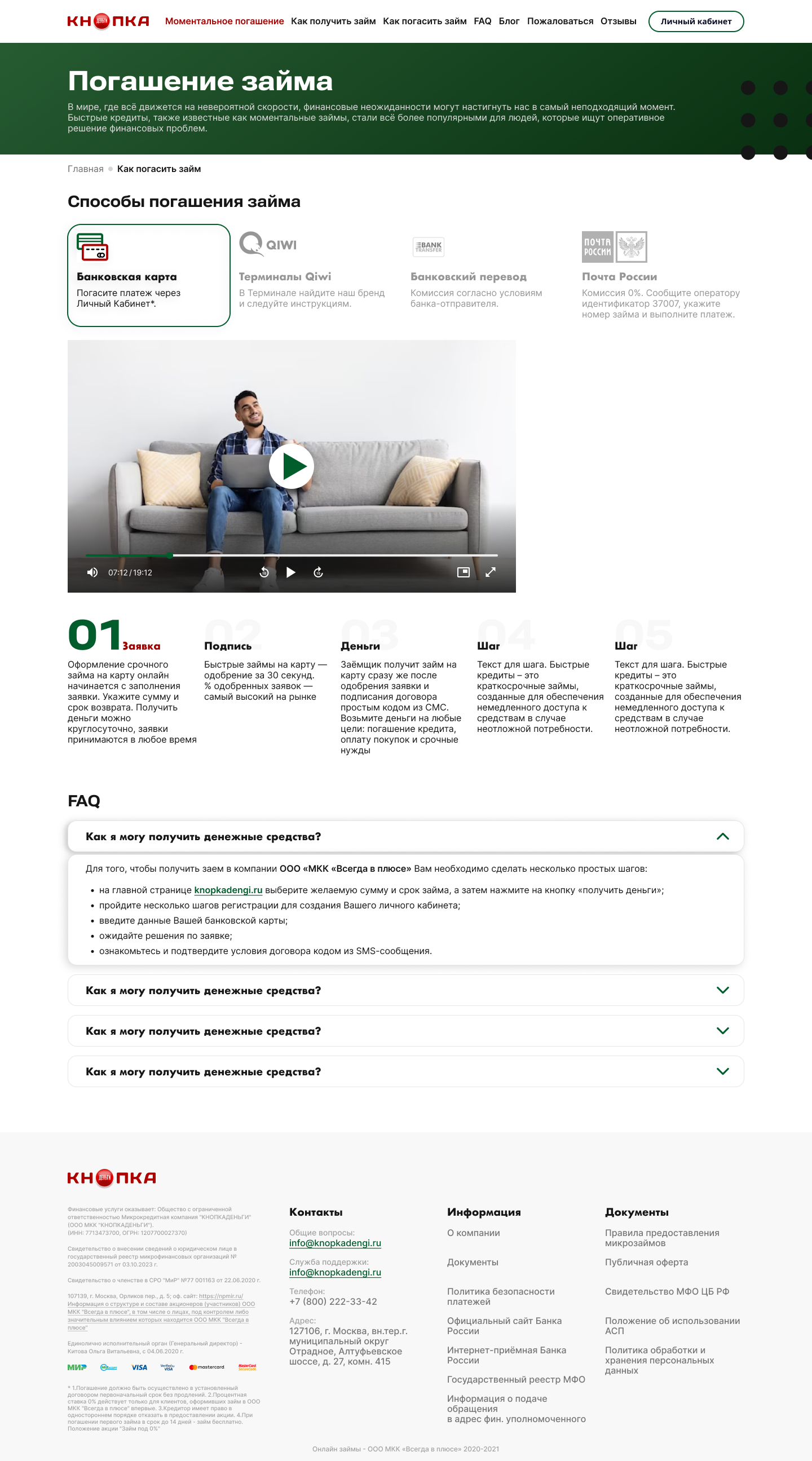
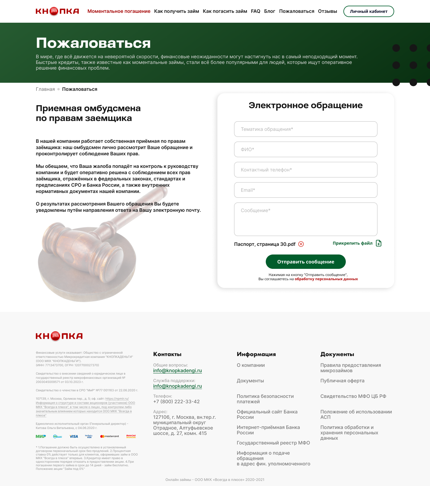
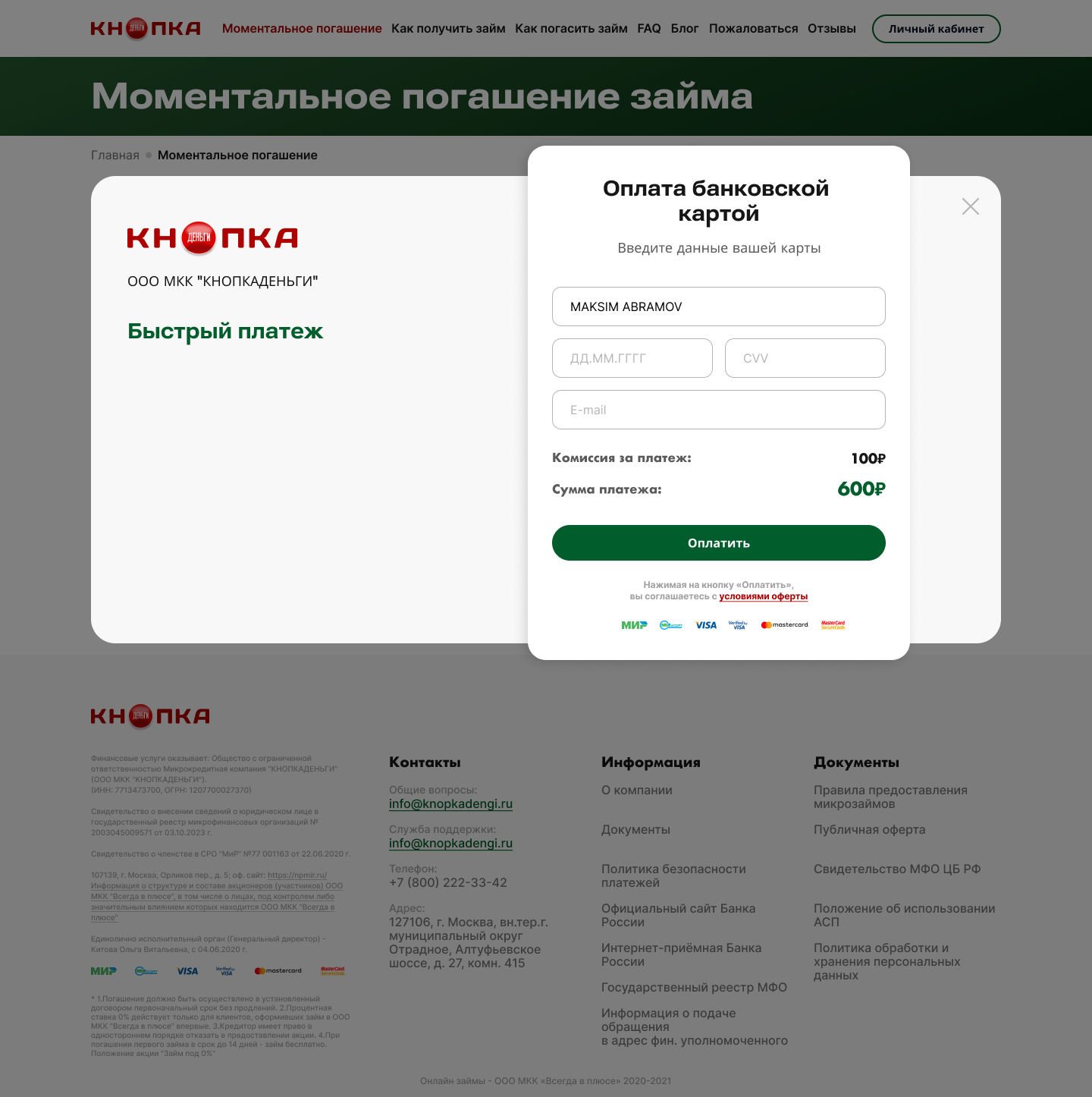
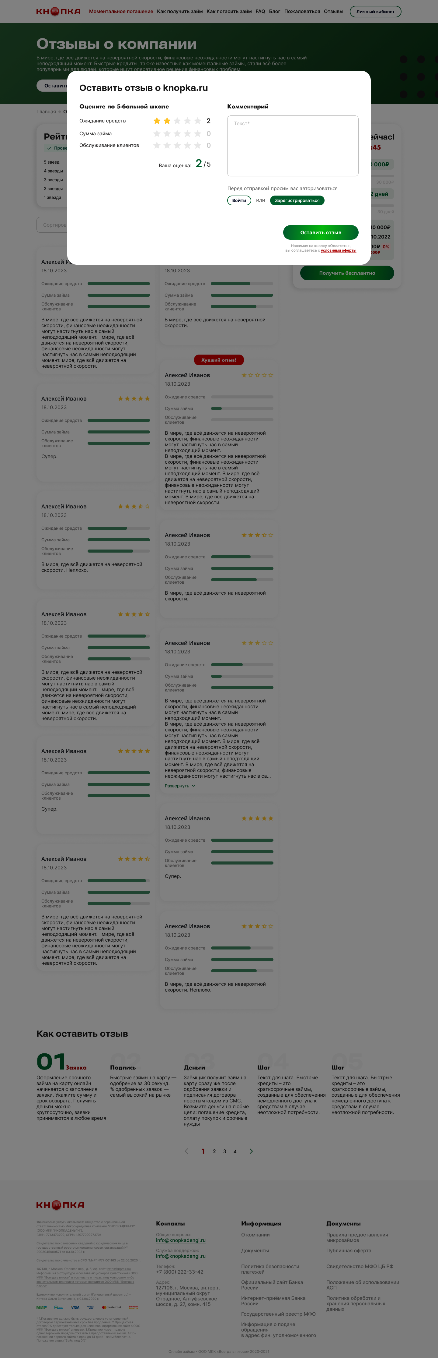
— Main pages defined: Home, FAQ, Loan Application, Loan Repayment, News, Articles, Reviews, Complaint, Instant Repayment.
— Clear and logical user journeys are designed — from first visit to loan repayment.
3. Key Screen Design
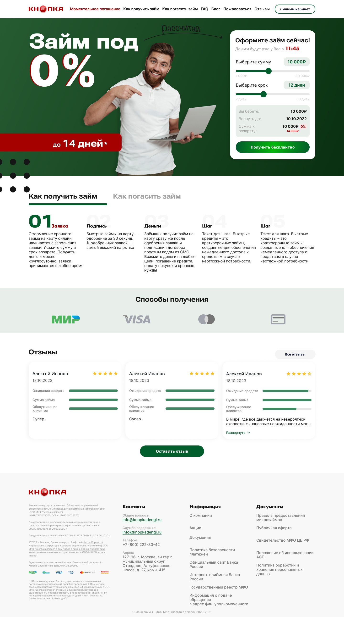
— Home page: emphasis on USP “0% Loan”, simple login form, blocks with benefits, reviews, and repayment methods.
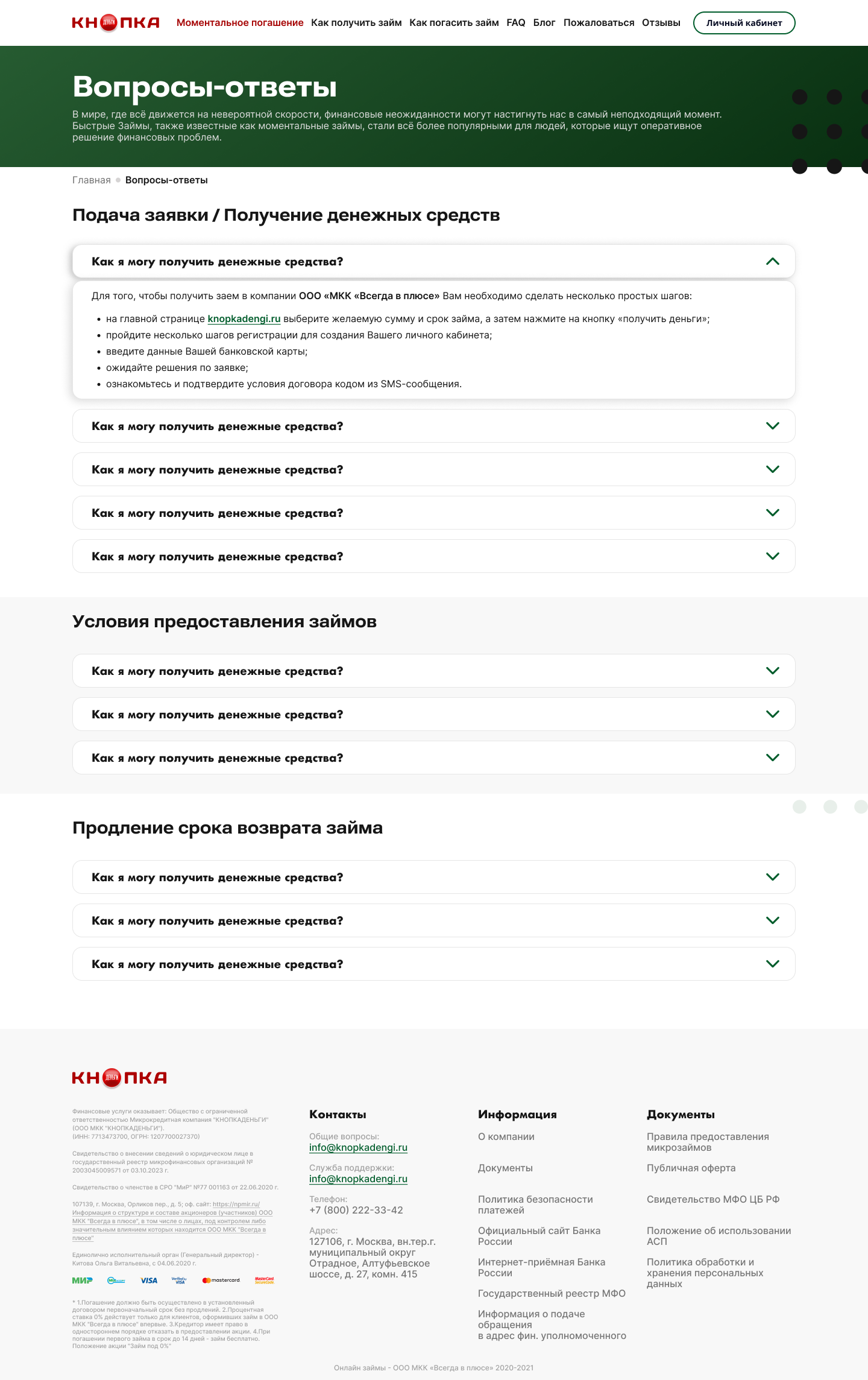
— FAQ: expandable blocks categorized by topics: terms, application, periods, repayment.
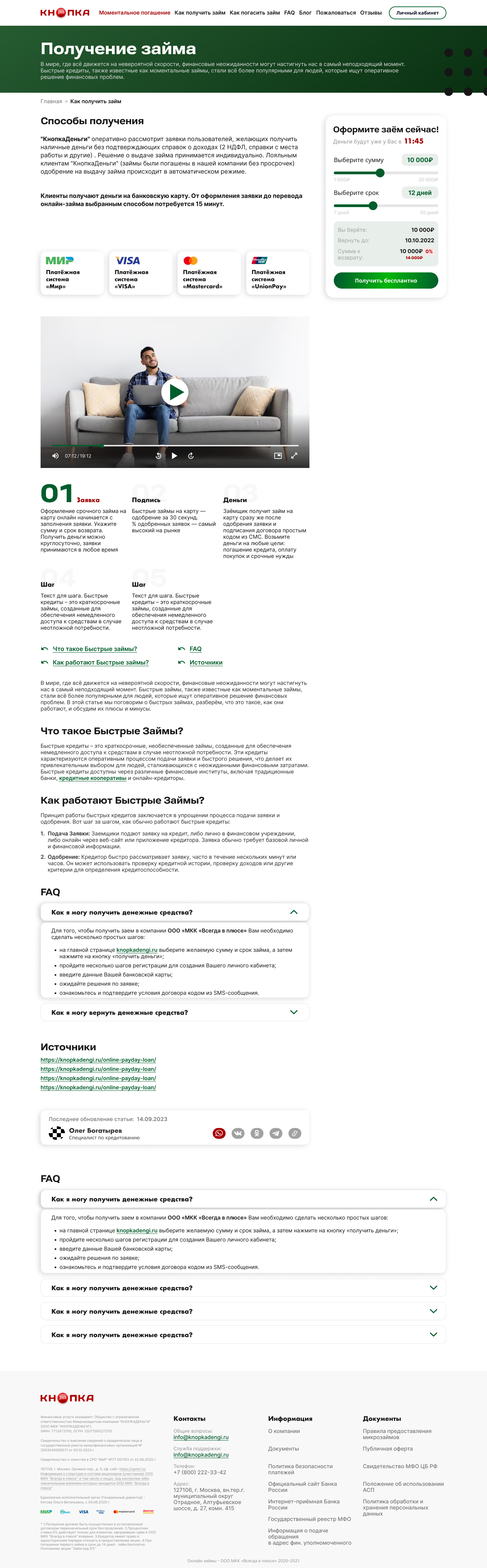
— How to apply / repay: step-by-step visual instructions, recurring blocks (payment, contacts, FAQs).
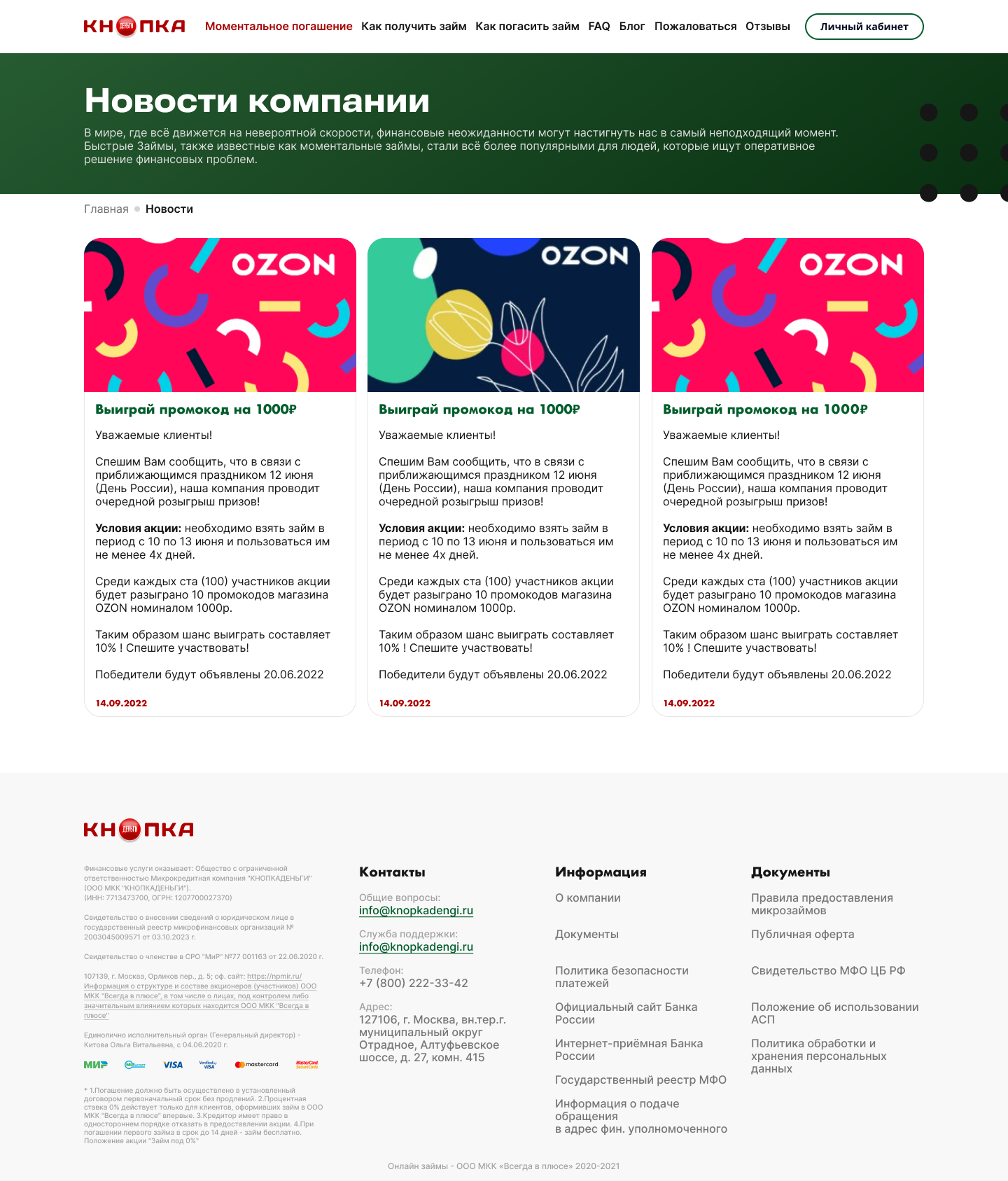
— News & Articles: SEO content informing about partnerships, service updates, and economy.
— Reviews & Ratings: filtering, pop-up review form, display of cases and average rating.
— Instant Repayment: minimalist mobile-first form with three interface states — empty, input, confirmation.
4. UI Design and Visual Style
— Color palette: green + white + accent colors — associated with trust and finance.
— Clean typography: easy-to-read fonts, strong contrast between headings and text.
— Icons and illustrations reflect the theme (money, cards, clocks).
— Responsive layout — fully optimized for mobile devices.
5. Interactivity and States
— Designed pop-ups, forms, and action confirmations.
— Implemented interface states: empty, filled, error.
— Users always understand where they are and what happens next.
6. Quality Control and Scalability
— All templates and components follow a unified style — easy to scale.
— Layouts are adapted for developer handoff (SPA or CMS).


The updated UX structure and UI design increased microloan conversion rates by 37%, reduced the average application time by 28%, and led to a 54% rise in positive user reviews during the first month after launch. SEO performance improved with a 41% growth in organic traffic driven by content blocks. Thanks to responsive design, over 82% of users now complete key actions on mobile devices.