10 Design Mistakes That Are Killing Your Sales

Introduction
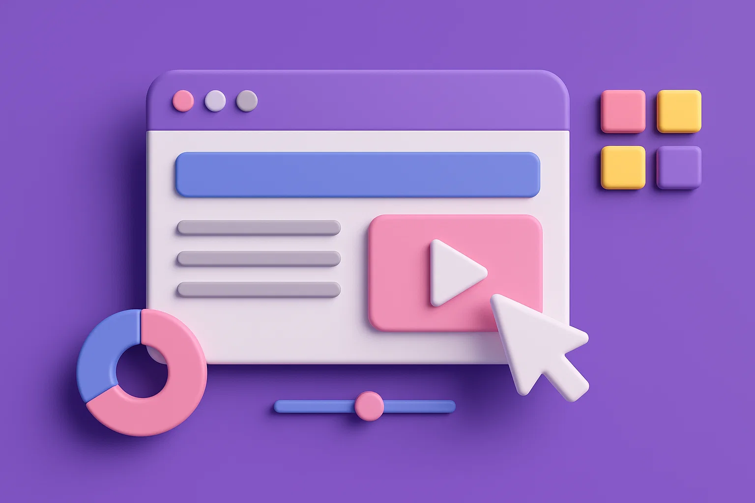
In the digital world, you have just 50 milliseconds to make a first impression. If your website or app design fails to build trust in that time, the user is gone forever. Many entrepreneurs treat design as a subjective matter of "beauty," but it is actually a precise engineering discipline where mistakes lead directly to lost profits.
In this article, we'll break down the 10 most costly design mistakes that are holding your business back and explain how to avoid them.
1. Lack of Visual Hierarchy
What it means: Headlines, text, buttons, and icons all compete for attention, causing the user's eye to wander across the screen without understanding what is most important.
Why it's dangerous: Eye-tracking studies show that users scan pages in predictable patterns (often an F-pattern). A lack of hierarchy breaks this pattern, increasing cognitive load and causing users to leave without finding the main call to action.
2. Poor Contrast and Ignoring Accessibility
What it means: Light gray text on a white background, pale buttons, or important information conveyed only by color.
Why it's dangerous: You voluntarily exclude up to 15% of your audience with various visual impairments. International accessibility standards (WCAG) are not a formality but a way to avoid losing paying customers.
3. Typographic Chaos
What it means: Using three or more different fonts on one page, inconsistent line spacing, and excessively long lines of text.
Why it's dangerous: It creates a sense of unprofessionalism and disorder. Scientific studies confirm that proper line length (45–75 characters) and line height (130-150%) directly affect reading speed and comfort, and thus the perception of information.
4. Visual Clutter
What it means: A lack of "white space"—the empty space between elements. The desire to fit everything onto one screen.
Why it's dangerous: This is a direct consequence of violating Hick's Law: the more choices you give a user, the more time they need to make a decision. A cluttered interface leads to choice paralysis and increased bounce rates.
5. Inconsistency and Broken Expectations
What it means: Buttons, links, or icons look and behave differently on various pages of the site.
Why it's dangerous: This violates Jakob's Law: users expect your site to work the same way as other sites they know. An unpredictable interface is annoying, requires extra thought, and erodes trust.
6. Designing in a Vacuum (Without Real Content)
What it means: Mockups designed with perfect placeholder text and stock photos that fall apart as soon as real content with long headlines is inserted.
Why it's dangerous: The final product looks nothing like the design, leading to costly revisions during the development phase and missed deadlines.
7. Ignoring Mobile Users
What it means: A design that looks great on a large monitor but turns into a mess on a smartphone screen with tiny buttons and misaligned blocks.
Why it's dangerous: Today, over 60% of all internet traffic comes from mobile devices. According to industry research, mobile users are 5 times more likely to leave a site if it is not optimized for them.
8. Overly Complex and Long Forms
What it means: Sign-up or contact forms with a dozen fields, most of which are not essential.
Why it's dangerous: Every extra field is a barrier that reduces conversion. Major e-commerce studies show that reducing form fields can increase conversions by 20-30%.
9. Lack of Social Proof
What it means: The site has no testimonials, case studies, client logos, or real numbers to back up your expertise.
Why it's dangerous: You're asking the customer to take your word for it. According to industry research, 88% of consumers trust online reviews as much as personal recommendations. A lack of such proof is a missed opportunity to alleviate doubts.
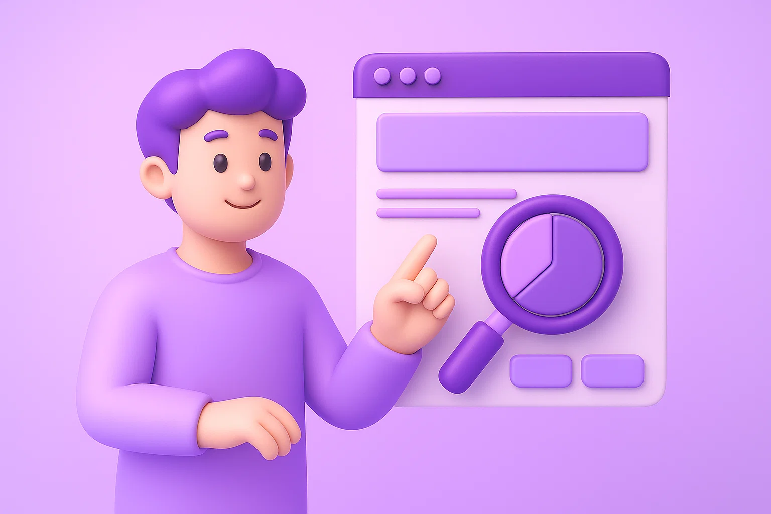
10. Lack of Testing and Analytics
What it means: Making design decisions based on taste ("I think this looks nicer") rather than on user behavior data.
Why it's dangerous: You are operating blind. A/B testing even minor changes, like a button color or headline text, can lead to double-digit conversion increases. Without data, you lose this opportunity.
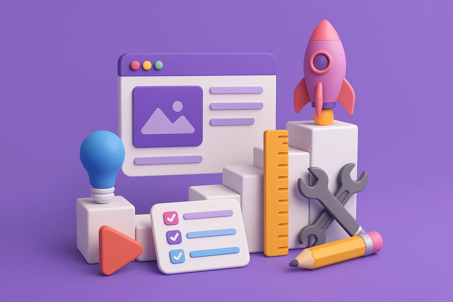
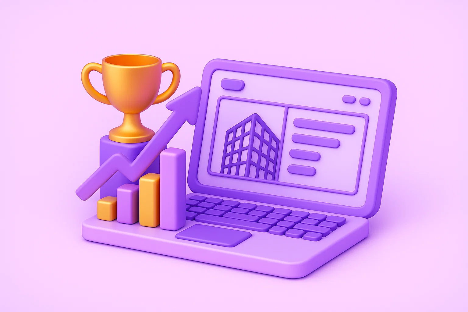
Professional Design as a System, Not a Collection of Mistakes
At DaT Studio, we approach design as an engineering discipline aimed at achieving business results. Our comprehensive and systematic approach helps avoid these mistakes, turning your visuals into a powerful sales tool.
If you want your design to not just look beautiful but to work for your business, contact us. We'll help you build a visual system that delivers results.
Other articles